

Prerequisites: You would need to have Jupyter Notebook installed. Python 3.7 and Pandas 0.25.1 were used for this post. You would also need the following packages:
- plotly pip install plotly==4.1.0
- itertools (usually pre-installed with Python)
All the code used in this article, and the sample data used is available from my GitHub page.
Sample dataset:The sample dataset is a random dataset, which contains HR employee data for a fictional company ABC Corp. The dataset has 14,999 records for 10 variables:
- left: whether an employee left the company
- satisfaction_level: employee's satisfaction level with the company
- last_performance: employee's performance rated by the company
- no_of_projects: number of projects an employee has worked on
- avg_monthly_hours: average of monthly hours worked by an employee
- years_spent: number of years spent at the company by an employee
- work_accident: whether employee had any work accidents at the company
- promoted_last_5yrs: whether employee was promoted in the last 5 years
- department: department of employee
- salary_range: salary range (high, medium, low) of the employee.
Expectation: Normally, for this kind of dataset you would need to build a predictive model out of some of the variables (Explanatory Variables) to predict one variable (Response Variable). The response variable in our case would be 'left', i.e., we would want to create a model based on all other variables to predict which employees are susceptible to leaving. However, before starting to create our model, we would want to explore the variables to see what kind of relationship exists between the given variables. This step is important because this would help us in variable selection i.e. select variables which can be expected to create a meaningful model. Also, this step helps to identify variables which are correlated among themselves. In an ideal scenario, we would only want explanatory variables which are independent of each other; i.e. they are not correlated. Having correlated variables in a predictive model can make the model sensitive to small changes in the variable values, making the model unstable and un-reliable for any realistic prediction.
Data-visualization: The easiest way to explore the variables is to examine them visually, for which plotting graphs of the variables becomes necessary. Plotting in Python can be a tedious job as there could be a number of explanatory variables. Additionally the variables can be numeric or non-numeric making this job even more cumbersome.
Interactive charts: Therefore, I present a method by which this method of creating graphs for the explanatory variables could be fully automated. In fact, you would be able to generate all kinds of plots, very easily, in a matter of seconds. Also, to make the graphs as much informative as they could be, we are going to use interactive charts. To understand what an interactive chart looks like, see the animated image below.
To create the interactive charts we would use the plotly library. You can install plotly by performing the command pip install plotly==4.1.0 from your console.
Automating the chart creation process:
First we need to import all required libraries.
import pandas as pd
import itertools

# Plotly
import plotly.graph_objects as go
import plotly.express as px
Next, we would read our sample dataset in a data frame called df.
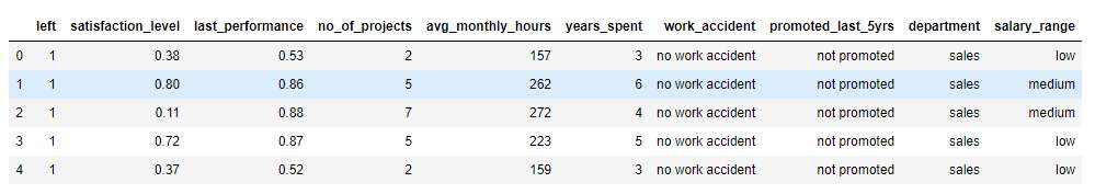
df = pd.read_csv('MultiplotsData\SampleData.csv')
df.head()
You should see the following after the data frame has been read.
Dataset Preparation: Now we check the data types of the variables. This is important to check before as data types of the variables would decide what kind of graphs are suitable for visualizing them.
df.dtypes
We would see the following output:
left                    int64
satisfaction_level    float64
last_performance      float64
no_of_projects          int64
avg_monthly_hours       int64
years_spent             int64
work_accident          object
promoted_last_5yrs     object
department             object
salary_range           object
dtype: object
We need to convert all variables which are of object type into categorical variables. This can be done as below:
df['work_accident'] = df['work_accident'].astype('category')
df['promoted_last_5yrs'] = df['promoted_last_5yrs'].astype('category')
df['department'] = df['department'].astype('category')
df['salary_range'] = df['salary_range'].astype('category')
df.dtypes
Now we would see that only numerical and categorical variables are present in our dataset.
left                     int64
satisfaction_level     float64
last_performance       float64
no_of_projects           int64
avg_monthly_hours        int64
years_spent              int64
work_accident         category
promoted_last_5yrs    category
department            category
salary_range          category
dtype: object
This means we are ready to create the automation functions. Please note that this is a very simple case of a dataset. You may further need to clean the dataset in your individual case (for example dealing with missing values).
Automated Chart function for individual variables: We first create a function which would automate the chart generation for all variables individually. We call this function MultiPlots_Univariate. This function takes a data frame argument (called df_plot inside the function). The function looks like below:
def MultiPlots_Univariate(df_plot):

    for col in df_plot.columns:
        if (df_plot[col].dtype == 'int64') or (df_plot[col].dtype == 'float64'):
            #uses Plot.ly express
            fig = px.histogram(df_plot, x=col)
            fig.update_layout(title=go.layout.Title(text=col,x = 0, font=dict(size=18,color='red')))
            fig.show()
        elif df_plot[col].dtype == 'category'
            df_pie = df_plot.copy()
            #Pie plots need data to be arranged in terms of the pie sizes, hence use groupby to get sizes of each group
            df_pie.insert(0,'freq', 1) # Insert a column for the frequency of the group
            df_pie.insert(1,'%', 1) # Insert a column for the %size of the group
            df_pie = df_pie[[col, 'freq', '%']] # The data frame consists of just the required columns
            df_pie = df_pie.groupby(col).agg(sum) # Groupby each column by the groups, with values equal to sum of group
            df_pie['%'] = df_pie['freq'].apply(lambda x : 100* (x / len(df_pie)) )
            sizes = df_pie['%'].values
            values = df_pie['freq'].values
            labels = df_pie.index.values
            #uses Plot.ly go
            fig = go.Figure(data=[go.Pie(labels=labels, values=values, hole=.3)])
            fig.update_layout(title=go.layout.Title(text=col,x = 0, font=dict(size=18,color='red')))
            fig.show()

    return(0)
If you look inside the function, you could easily see what it is doing. We loop through all the variables in the data frame. We then check if the variable is of numerical datatype or a categorical variable. For numerical variables, we generate histograms; whereas for categorical variables we generate, pie charts. You can add more chart types if you wanted. The important thing is that, by this method we can generate all required charts with a single function. Note that for the histograms, we use the plotly express and for the pie charts we use the plotly go functionality.
We can call the function straightaway, by passing over our read data frame and this would generate all the interactive histograms and pie charts for all applicable variables.
MultiPlots_Univariate(df)
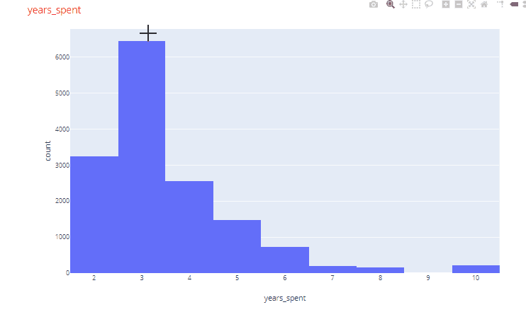
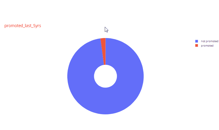
For example, in the histogram for years_spent variable, very few employees had worked for more than 5 years. Similarly, looking at one of the pie charts we find that very few employees (2.13%) were promoted in the last 5 years.
Automated Chart function for sets of two variables: Next we are going to create a function to generate charts for sets of two variables for all variables in the dataset. This is where the fun part begins. The trick here is to use the itertools function to select all possible combinations of two variables in the dataset. When we have all the unique combinations, then depending of the data types of the two variables we can decide which plots to create. Another fun trick is to use the matrix plot functionality of pandas which has also been extended into plotly express. The function looks like below:
def MultiPlots_Bivariate(df_plot):
#Matrix Plot All variables
fig = px.scatter_matrix(df_plot)
fig.update_layout(
width=1500,
height=1500,)
fig.update_layout(title=go.layout.Title(text = 'Matrix Plot All Variables', x = 0, font=dict(size=18,color='red')))
fig.show()
# We use itertools to create combinations of 2 elements from all variables
for combination in itertools.combinations(df_plot.columns, 2):
x= combination[0]
y = combination[1]
if ((df_plot[x].dtype == 'int64') or (df_plot[x].dtype == 'float64')) and ((df_plot[y].dtype == 'int64') or (df_plot[y].dtype == 'float64')):
pass
elif (str(df_plot[x].dtype) == 'category') and ((df_plot[y].dtype == 'int64') or (df_plot[y].dtype == 'float64')):
fig = px.box(df_plot, x=x, y=y)
fig.update_layout(title=go.layout.Title(text = 'Boxplot {} vs {}'.format(y, x), x = 0, font=dict(size=18,color='red')))
fig.show()
elif (str(df_plot[y].dtype) == 'category') and ((df_plot[x].dtype == 'int64') or (df_plot[x].dtype == 'float64')):
fig = px.box(df_plot, x=y, y=x)
fig.update_layout(title=go.layout.Title(text = 'Boxplot {} vs {}'.format(x, y), x = 0, font=dict(size=18,color='red')))
fig.show()
elif (str(df_plot[x].dtype) == 'category') and (str(df_plot[y].dtype) == 'category'):
#create stacked bar chart
xtab = pd.crosstab(df_plot[x], df_plot[y], dropna=False) # pandas cross tab feature comes very handy
x_row = list(xtab.columns[:]) # the x axis would be the same for all stackings
fig = go.Figure()
for i in range(0, len(xtab.index)): #we loop through all the rows
fig.add_trace(go.Bar(x=x_row, y=xtab.iloc[i], name = xtab.index[i])) #with iloc select the entire row as stack
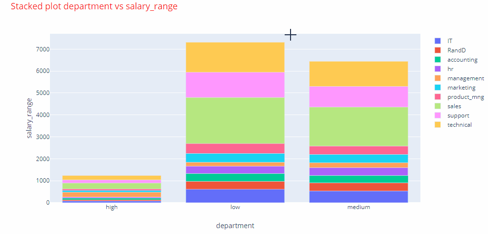
fig.update_layout(barmode='relative', title = go.layout.Title(text='Stacked plot {} vs {}'.format(x, y), x = 0, font=dict(size=18,color='red')))
fig.update_layout(xaxis=go.layout.XAxis(title=go.layout.xaxis.Title(text=x)),yaxis=go.layout.YAxis(title=go.layout.yaxis.Title(
text=y)))
fig.show()
We first create a matrix plot of all variables in the data frame with the scatter matrix plot functionality of plotly express. Next, for combinations of numerical and categorical variables we generate box plots grouped by the categories. So the categories are always on the x axis. For the combinations of categorical vs categorical variables, we create stacked bar charts. Creating stacked bar charts in plotly is tricky. Luckily we have pandas cross tab feature to the rescue. With the cross tab, we select all the values for a row and then stack them as separate groups on the y axis. This helps in creating the stack bar charts.
As before we can create all the plots for our dataframe, by simply calling the function as below.
MultiPlots_Bivariate(df)
And boom! you have all the plots ready for you analysis.
The matrix plot looks like below. On the interactive plot you could hover over and see the underlying values. The matrix plot allows you to quickly identify variables that may have a correlation. Here in our example, we can clearly see that none of our explanatory variables are correlated.

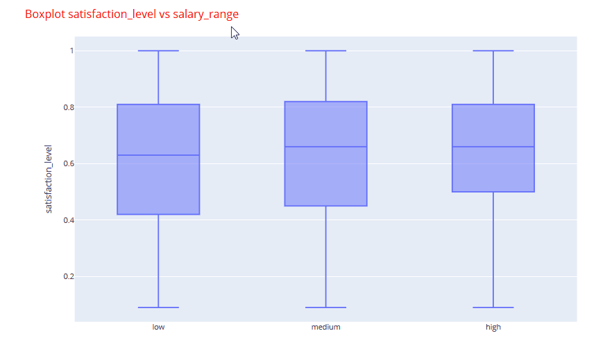
An example of one of the box plots is shown below. You can quickly analyze that the satisfaction levels are nearly identical with a marginal increase in the higher salary band.
If we look at one of the stacked bar plots, we can clearly identify that maximum number employees were promoted in the management, marketing and sales departments.

All of the interactive charts for the sample dataset can be found in the Jupyter Notebook file.
So there you go, with two custom functions you can generate all the charts for a dataset in a matter of seconds.
MultiPlots_Univariate(df)
MultiPlots_Bivariate(df)
You may, if you like, combine the two functions in a single function. Please note that you may use the plain vanilla charts of the matplotlib library, in a similar manner, for even faster chart generation.
Conclusion: Automating the chart generation process saves you time, which can be very useful when selecting variables for model creation or generating insights from a given dataset.
Post your comment